Vintage Deposit Box: Material Breakdown
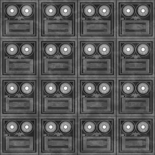
This is a breakdown of my vintage deposit box material and the steps I took to create this material. It was a fun exercise and a great way to create complicated shapes. In the process I also learned a few new nodes and techniques in the process.
The first step was to do a reference pull. I kept a few questions in mind while I worked on the material:
- How old is the deposit box?
- What type of materials are used to make it?
- Is it tile-able?
- What is the purpose for the lockbox?
- How would human interactions affect it?
 |
| Reference |
After doing a reference pull I broke down the asset into a few components :
Frame and Dials
Eagle head, shield and wings
Additional details
The frame is broken down into a few parts, the frame, the opening mechanism, the number tags and the dial. Looking at the overall shapes you will see circles and rectangles so, I constructed the frame work for the panel.
 |
| Basic Shapes |
Underneath the frame the panel has a star burst affect coming from the center of the panel. In the reference some deposit boxes didn't have them or the patterns were more intricate. For stability and leveling purposes I stuck with the starburst. I knew I needed space for the number tag so, I subtracted the star bust from that space.
The number tags were simple enough. As the tag is symmetrical, I focused on one half and mirrored it.
The next step was to combine the tag and slot panels. Now to focus on the eagle center piece. This portion of the panel took a lot longer and required a lot more planning. But that comes a little later, now to add the dials.
 |
| Combined panel and tag layers |
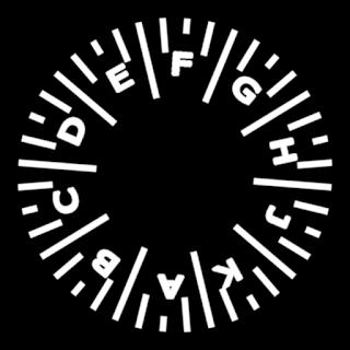
The dials were a bit of a challenge so to speed up the process I incorporated photoshop for the lettering on the dial. I didn't want a text node for each letter so it was easier and cleaner to use a texture. The nobs were given the star burst effect to give indication of grip. I used a circular splatter on the tick marks and for the lettering, I used Circular Path in photoshop. The last thing to do was combine the letters
 |
| Final Dial |
EAGLE HEAD, WINGS, and SHEILD
The deposit box was coming together. All that was needed now was to create the difficult parts; the wings, the head, and the shield.
 |
| Eagle Breakdown |
The eagle head required a lot of warping as well as the wings. Even though this is a metal imprint, I wanted the overall shapes to feel presentable. Compared to the shield which is flat, there was an edge that ran along certain sections. To achieve the beak look I used a blurred disk and a directional warp. Blurring the disc allowed for smooth transitions in the forms.
 |
| Beak Shape |
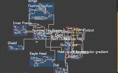
The wings were tedious as it required a lot of transform nodes. So I broke the feathers into subjections. The subjections allowed me to adjust the feathers as needed and layer them without overlap using the height blend node. To wrap things up I used the mirror node after creating the first wing.
 |
| Final Wings |
 |
| Final Eagle Emblem |
ADDITIONAL DETAILS
The last step was to now focus on adding my layers (non destructively).
 |
| Material Maps |
 |
| Normal Map |
 |
| Roughness Map |
The AO just required the combined layers. I didn't want the cavities to feel deep or overwhelm the albedo maps. Using the roughness map for my albedo muddied the material so I went back to using the combined layers. The albedo was the last step in the process because I wanted the deposit boxes to feel aged.
A few things I wanted to incorporate were weathering from human interaction and labels to establish ownership. Oxidization was the first thing that came into mind after looking over my reference. It occurs when the oils on our hands interact with metal, causing it to patina. Sometimes the oils build up with dust in the cracks.
 |
| Albedo Map |
This was a fun project to work on overall. I was able to work on intricate shapes and get a better understanding on natural affects.
 |
| Final Result |


Comments
Post a Comment